UI Prototyping for Mobile Application

Shadows & Secrets – Mobile Companion App:

Mobile Prototype Link (in case the embedded doesn’t work)

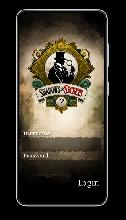
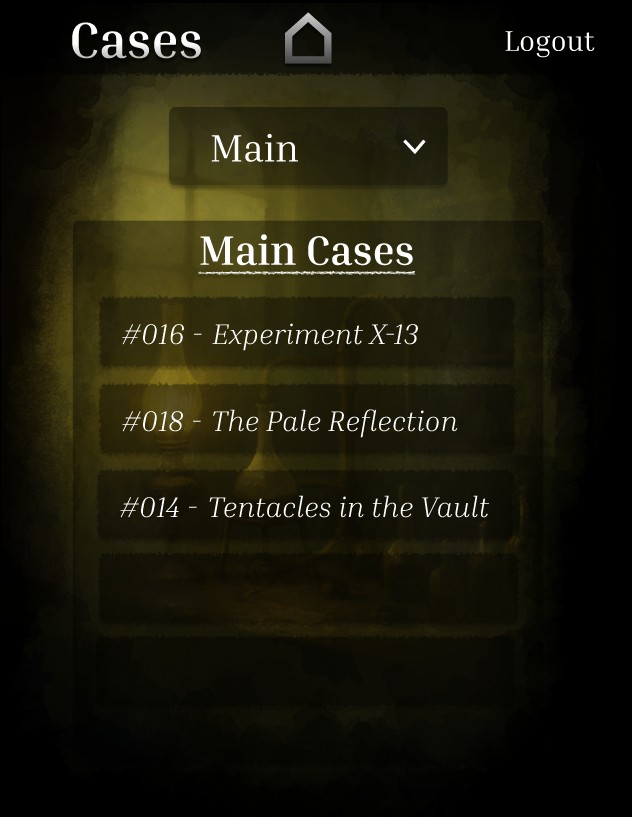
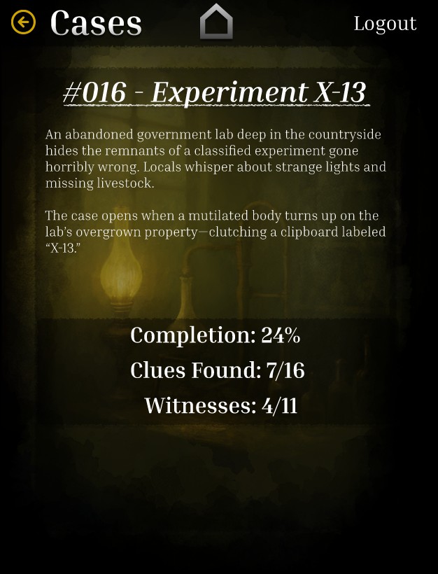
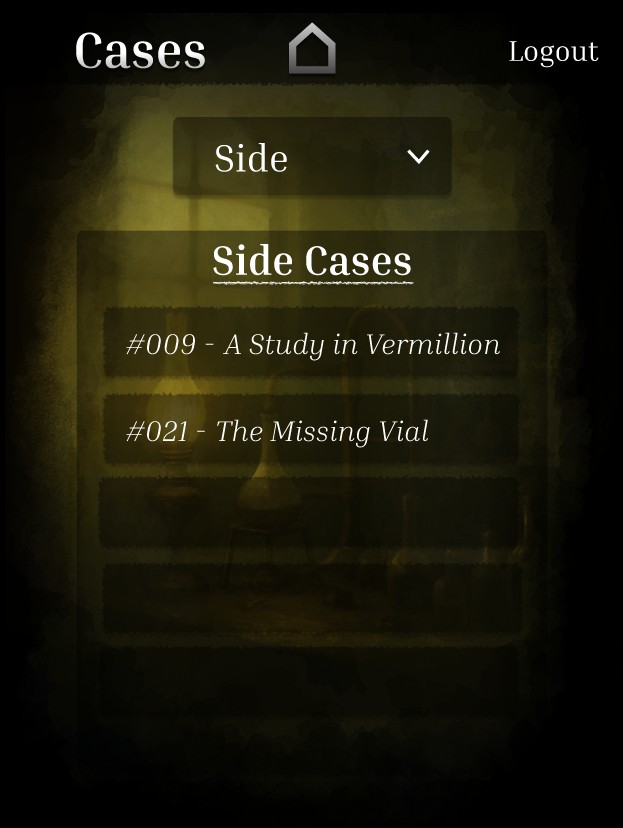
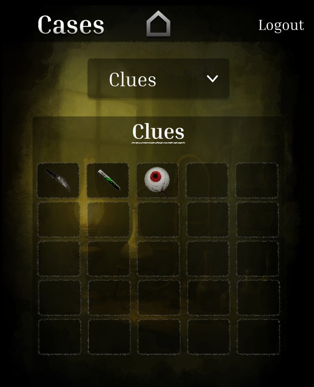
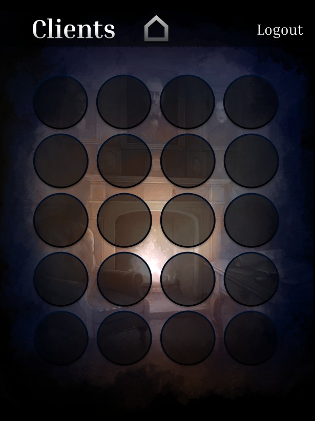
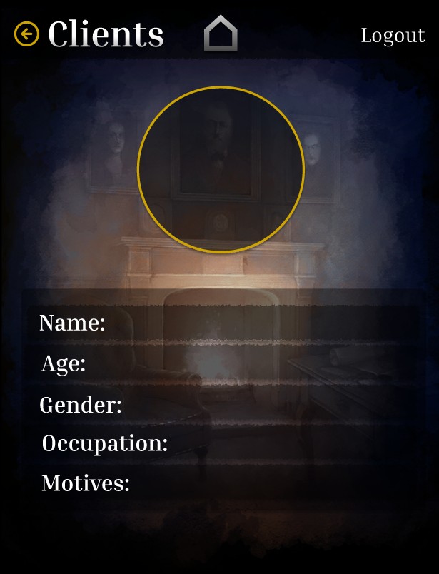
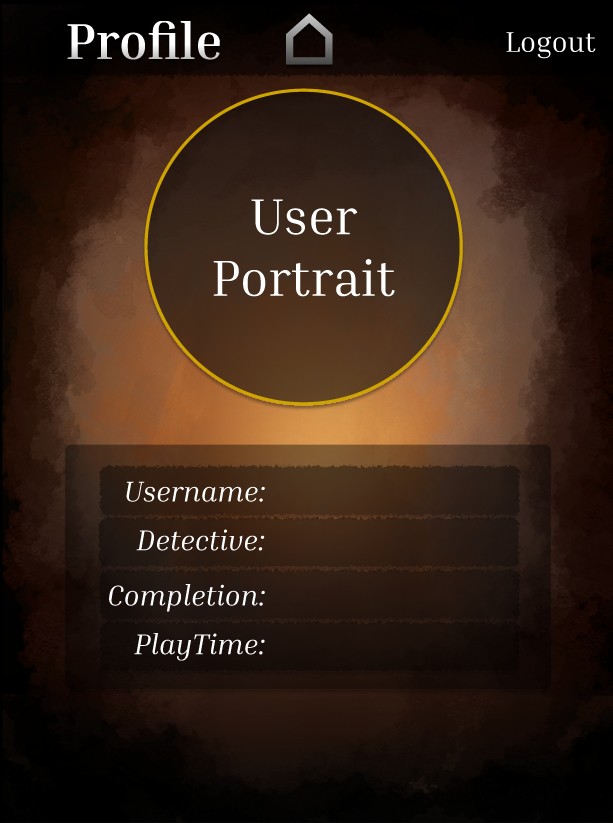
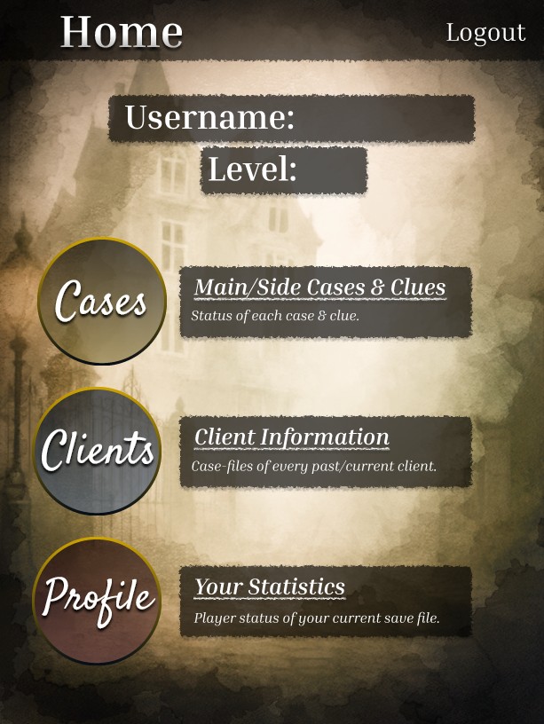
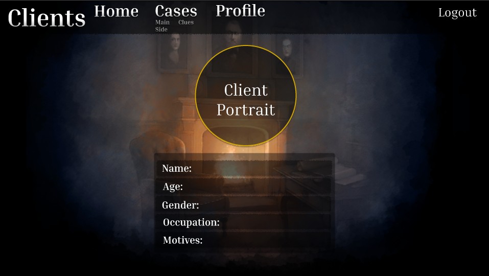
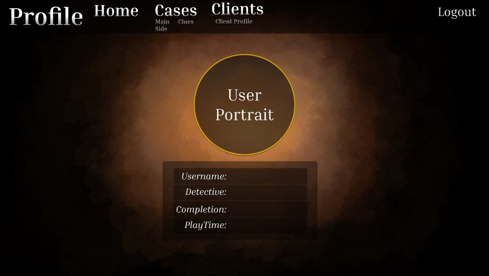
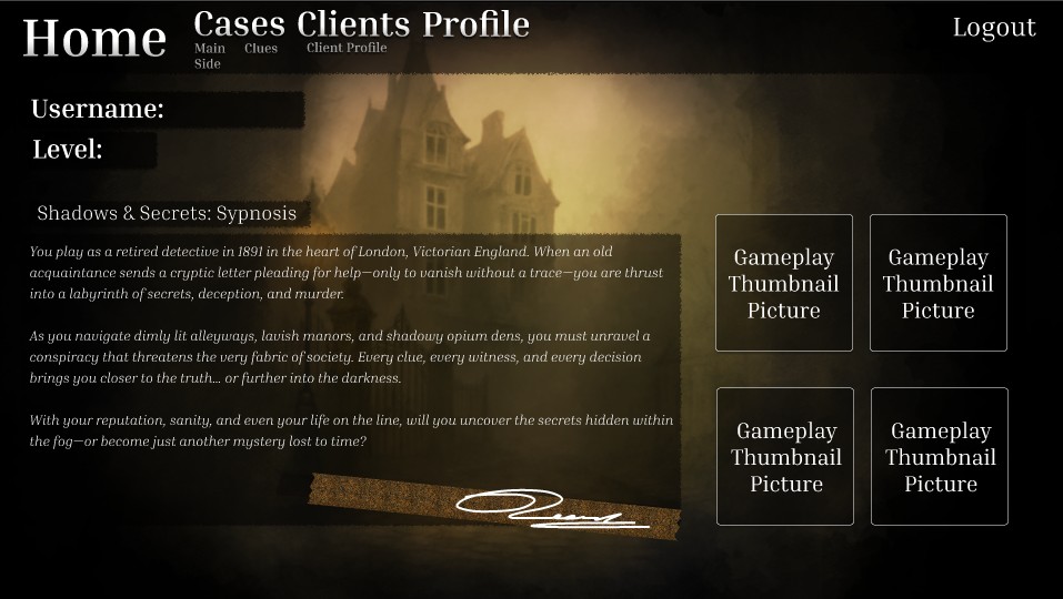
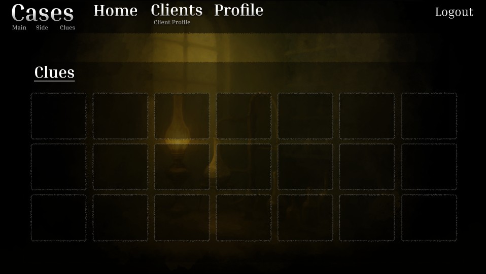
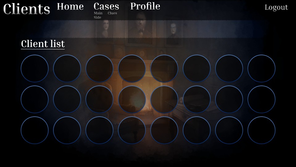
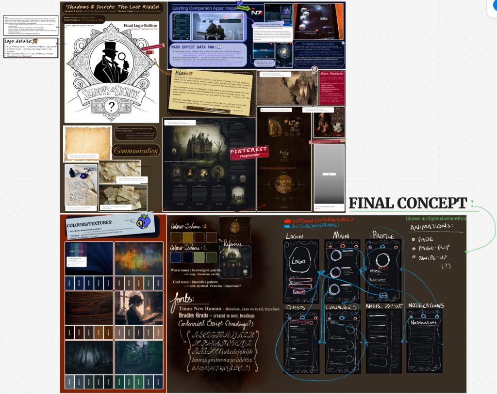
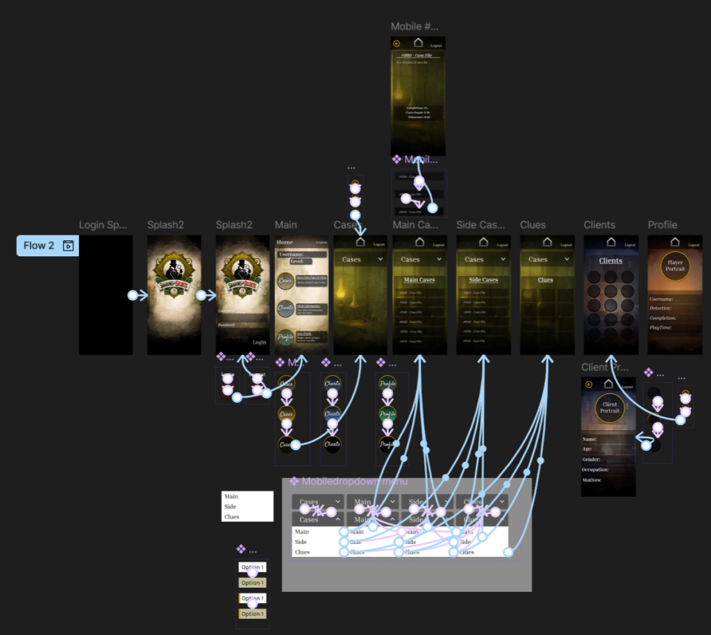
During the mobile prototyping phase, I took my wireframes from the tablet version that I had started with and transformed them into a polished mobile interface, using the large Android resolution (366 x 800). Beginning with the tablet version, however, posed some challenges – I quickly realized that shrinking component sizes, while still keeping everything readable and user-friendly, was trickier than just scaling things up, especially when it came to interactive elements like buttons and icons.

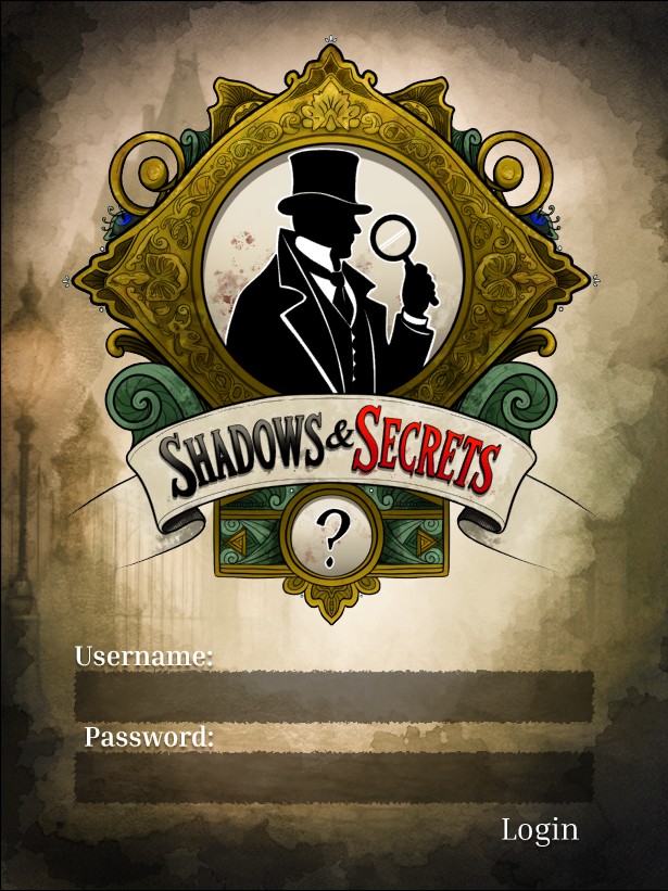
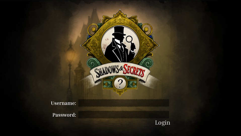
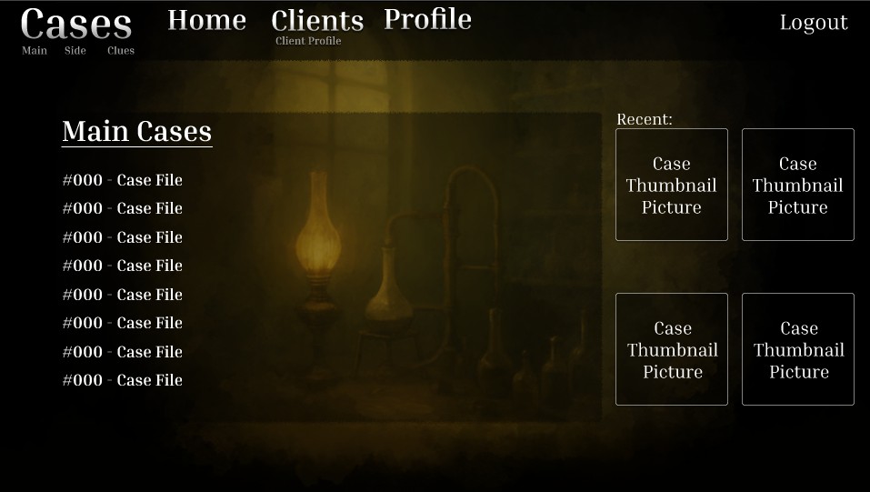
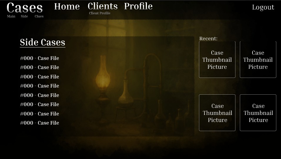
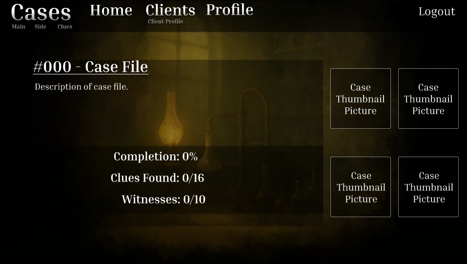
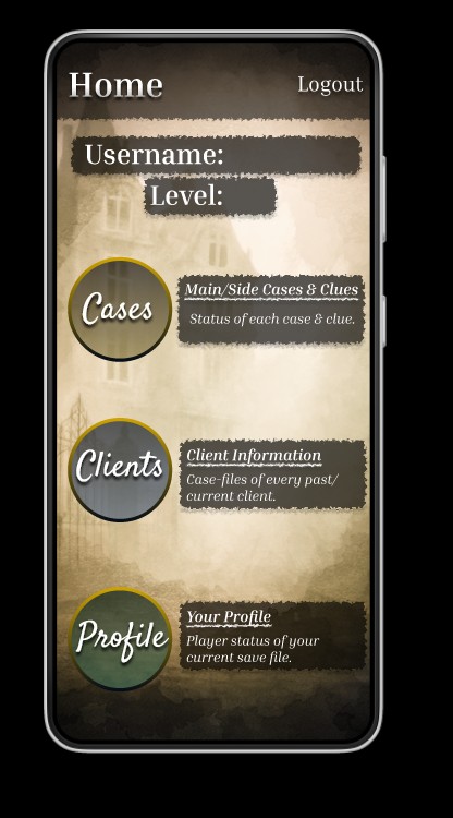
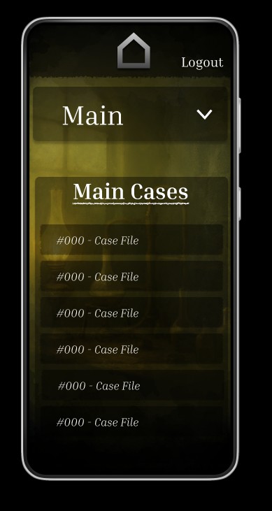
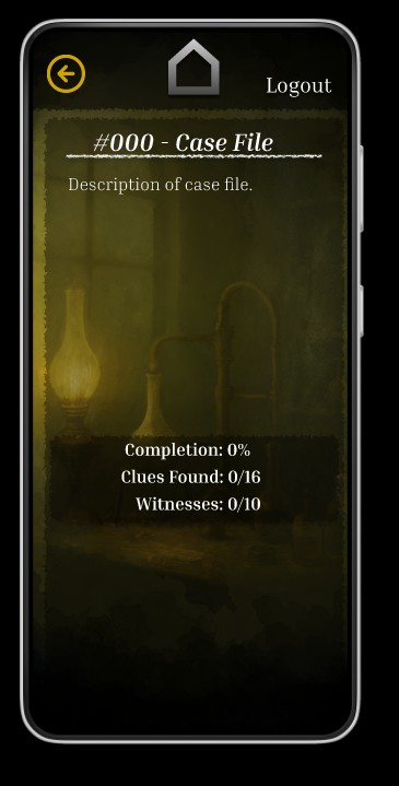
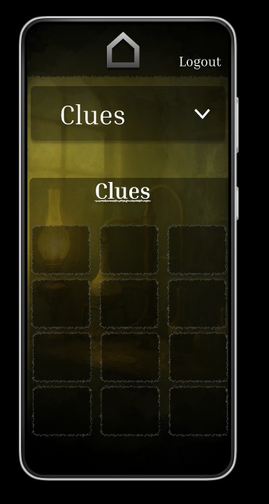
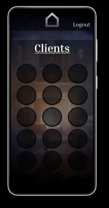
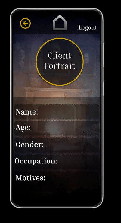
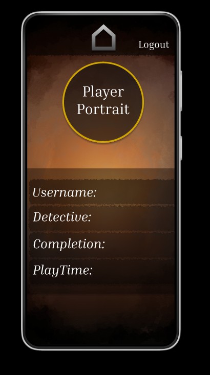
I kept the app’s core layout pretty much in line with my original concept. However, I decided to take a more artistic approach when moving to high-fidelity by swapping out the flat placeholder backgrounds for hand-crafted, murky digital watercolor paintings. Each screen now features a slightly different visual backdrop, which not only adds some variety but also helps create a narrative context throughout the interface. (The backdrops and logo were hand-painted in ClipStudioPaintPro.)

Another design aspect I considered was adding sound effects, like a gentle page-turning sound when moving to a new screen. The goal was to boost immersion without overwhelming the user. In the end, though, I chose not to include this feature in the prototype, as I envision the web version of the app being more functional and streamlined, without any auditory feedback or flashy visual transitions. This distinction between the mobile and web platforms, where mobile feels more atmospheric and the web is more utilitarian, helped shape my decisions about which features to prototype now and which ones to save for later updates.

All in all, the high-fidelity prototyping journey was all about finding the right balance between mood and clarity while tackling the technical challenges that popped up due to screen size adjustments and cross-platform considerations.

Adapting Your Design for Web Deployment

Tablet:

Tablet Link (in case embedded doesn’t work)

Website:

Website Link (in case embedded doesn’t work)

For this final stage, I took my existing mobile design and transformed it into versions for tablet and web, making sure everything works seamlessly across platforms. Since I had started the design process with a tablet resolution of 768 x 1024, this version was the most fleshed out from the beginning.

During the tablet design phase, I also dove deeper into the content by crafting more detailed case file screens. I came up with several hypothetical cases to showcase how each case file could look if the game existed. This included unique case titles, descriptions, and progress meters to capture the essence and tone of each fictional investigation.

Switching to the web version (1920 x 1080) turned out to be easier than I anticipated. I discovered that enlarging components instead of shrinking them gave me more flexibility and led to fewer design headaches. Typography flows more naturally on larger screens, and I had more space to allow larger buttons and a consistent visual hierarchy. I was also able to reduce the contrast for some backdrops, since there was more dark, extra space for text to be easier to read – this added to the mysterious, murkier vibe of the site. The extra horizontal space also allowed for more traditional desktop layout patterns, like a navigation bar at the top of the screen.

A significant change in the web adaptation was adding extra button links across various screens. Unlike mobile apps, where navigation tends to be more linear or nested, most websites let users easily access all major sections from nearly any page. To accommodate this, I designed a straightforward, persistent navigation bar that links directly to each key screen—Case Files, Clients, Player Profile, and Home—reducing the need for complicated multi-step navigation.

All three versions—mobile, tablet, and web—were created within the same Figma file for easy access to shared components and better version control.

Design and Research

Using a Figjam board, I started working on a companion app for Shadows and Secrets, a Victorian-era detective game. This app will deepen player immersion with a themed UI that matches the game’s mystery-driven narrative and Victorian-England aesthetic, while allowing players to keep tabs on their story progression.

I started by defining the core goal: to create a simple, intuitive interface that feels like an extension of the game world, like flipping through an old case file or reading a mysterious letter. This was the guiding principle for all my design and interaction decisions.

During competitor research, I strongly reference games like Sherlock Holmes: Crimes & Punishments and apps like The Mass Effect Datapad. These showed how minimal, immersive interfaces can enhance narrative without overwhelming the player. I also try to keep buttons to the left of the screen for accessibility, and noted how UI tone and layout affect player immersion and clarity.

My mood board presents Victorian architecture, parchment textures, ink blotches, calligraphy, and rich muted colour palettesburnished golds, antique reds, and deep browns. I also explored opposite colour palettes – deep greens and inky, murky blues. The warmer colour palette feels closer to the original concept of parchment, however, the cooler palette feels more mysterious. I decided to stick with the warmer palette in the end. I also gathered style inspiration from Pinterest, referencing historical ephemera to guide flourishes like ornate borders and letterpress-style UI elements.

User personas are for two target groups: mystery game enthusiasts who love lore and detective work, and casual players looking for light narrative interaction. This helped inform my decisions about clarity, thematic consistency, and accessibility.

Overall, this design research phase established a strong conceptual and visual foundation for me. It ensured that every design choice—from colour to layout—enhances not only usability but also the storytelling of Shadows and Secrets.

References:

User Flow and U.I Wireframing

In this phase, I developed the user flow and wireframed the UI for Shadows and Secrets, the companion app to the main detective game. I used Figma to map out the whole app and create wireframes, focusing on functionality while reflecting the game’s Victorian and detective themes, and referenced my FigJam board when creating the wireframe, referring to my final concept.

The main features of the companion app are a login screen, followed by a main menu with three main navigation options: the Cases menu, Client menu, and Profile menu. Each section was designed with the player’s investigative journey in mind – I didn’t want to overcomplicate the design wireframe, and kept it simple like a book/journal.

In the Cases menu, I created dropdown buttons to access Main Cases, Side Cases, and a third option that leads to the Clues menu. A technical limitation I hit during this was that I couldn’t assign the same “on-click” interaction to the dropdown buttons on the free FigJam plan. To get around this, I used the “when mouse is pressed down” interaction instead, which allowed me to simulate the dropdown behaviour.

The Client menu has multiple character buttons. When players select one, they are taken to a dedicated page with more information about that client, like reviewing a witness dossier. The Profile menu shows the player’s username, their chosen detective (male or female), the story completion percentage, and the overall playtime, a clean and personal overview of their progress.

A consistent visual goal throughout the app is to make it feel like turning the pages of an old journal or casebook. This supports the game’s tone and helps with immersion through simple transitions. Also, I plan to make the visual appearance more personal, using my artwork for backgrounds and hover animations, as well as add page-turning audio.